How to Create Amazing Comic book covers in 6 steps
26-Apr-25
Let’s first discuss the purpose of a comic book cover. Its role is to look
impressive on whatever rack or shelf it’s placed. The more eyeballs it draws,
the more the likelihood of sales. Therefore, the primary goal when designing or
illustrating your comic book cover is to make it as eye-catching as possible to
draw in those viewers.
Here are the steps that I follow to design my Comic book covers
1. RND - Research and Development
You should know the story of the comic book you are working on inside and
out. You must familiarise yourself with the content, characters, and the comic
book’s universe.
You can visit a comic book store and check out what is trending. Look at the
types of compositions, colour treatments, and art styles that resonate with
audiences in comic books.
Observe what other artists in the same genre are doing for their comic book
covers.
Your competition is significant; your comic book cover must distinguish itself
among all the existing titles in the market.
2. Concepts
Brainstorm ideas with the collaborators involved in the comic book. Visualize all
the concepts that come to mind. Consider what kind of composition or concept
would best suit your comic book.
Ideas could include:
- The comic book cover should highlight the main character in a striking or
signature pose.
- It could capture a key moment in the comic book story dynamically, such as
characters charging at their enemies in a fight or a poignant scene where the
protagonist embraces their loved one.
- It could portray all the characters in their element against the looming shadow
of the villain/villains in the background.
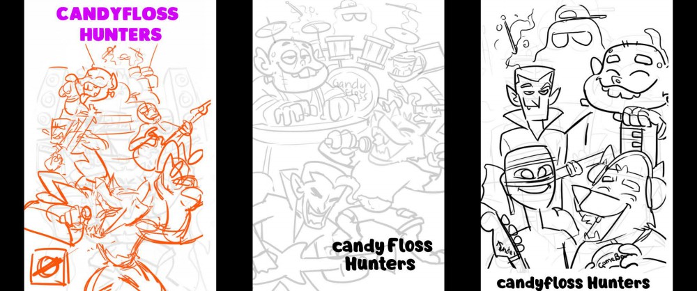
3. Thumbnails
After brainstorming a few ideas, the next step is to finalize a selection and
begin working on the thumbnails. Thumbnails are very rough sketches of your
comic book cover ideas; they serve as prototypes.
For better understanding, I’m sharing the process I followed for designing one
of my comic book covers. The title is Candyfloss Hunters, a comic book tale of
a band formed by five monsters who aspire to create great music, perform for
the world, and earn appreciation in return.
Here are the initial concepts I worked on for the comic book cover. We chose
the first option because it was more dynamic and all the characters were well
represented.
This is also the point where you determine the arrangement of other elements,
like the title, logos, and issue numbers, on your comic book cover.
Document Setup
I will provide you with the specifications for Photoshop since that’s what I used
for my comic book. My comic book is an A5-sized comic, so I work on an A4-
sized document to create a scaled-up version for high-resolution needs. The
screen resolution or DPI/PPI is set to 300 or 600. The bigger the DPI value the
better it is, as long as your system can handle it. Files tend to become heavy in
terms of space with increased PPI when working on a comic book design.
While designing your comic book cover, consider the following design
principles:
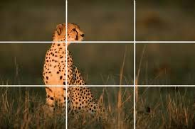
- Rule of Thirds: The space is divided into nine symmetrical segments, as
shown in the figure. The subject is placed along the lines created by these
segments, making it visually appealing in a comic book format.
- Rule of Odds: An odd number of subjects is always more interesting than an
even number. In my case, I have five characters in my comic book, so this
principle works perfectly.
- Simplification entails removing unnecessary clutter that distracts from the
subject of the comic book cover.
- Shallow Depth of Field: This is a camera technique where everything except
the subject in focus is blurred out, depending on its distance from the camera.
In some comic book compositions, if the subject is centrally located, the
background becomes blurred due to its distance, while objects closer to the
camera remain blurred, reinforcing the focus on the subject. This technique is
commonly used in filmmaking and could be adapted for comic book design to
shift focus between subjects in the same frame.
- Adding Values: This means incorporating shades of grey into your comic book
drawing. Background objects in the comic book are generally lighter, with
darkness increasing as they approach the foreground. This technique helps
create proper depth by ideally dividing the comic book drawing into foreground,
middle ground, and background. It also assists in determining if the silhouettes
of the subjects in your comic book are discernible. You can adjust the drawings
if the silhouettes aren’t clear in the comic book art. This is like an intermediate step for colouring. After setting in the values you can start coloring accordingly
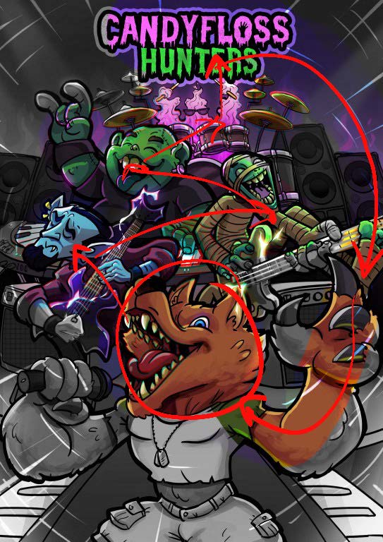
- Creating Movement: Compose elements so that the viewer’s eyes do not
linger on a single point but move from one area of the comic book cover to
another without exiting the illustration. In our case, the focus progresses from
the werewolf to the vampire, then to the mummy, Frankenstein, and finally to
the drummer alien, who points towards the title, leading back to the werewolf’s
hand through curved action lines.
- Other elements, like the action/zoom lines in the top corners and the stage
lights at the bottom, create a one-point perspective that draws the focus back
to the subject of the comic book. It’s intriguing, isn’t it!
5. Finalising the sketch
We’ll start with the first thumbnail sketch that we had finalised. It's time to fill in the details wherever necessary. Carve out the characters. Add in elements that
define them.
- Work on titles.
- Ensure characters, silhouettes, and gestures are clear.
- Check text readability.
- Eliminate unnecessary negative spaces and adjust the sketch.
- Verify that subjects are not clipped at the edges.
Next is the crucial and the most fun part of the comic book cover illustration
process
INKING!
It’s time to ink everything we’ve designed so far for our comic book cover and
finalize it. Start by setting the opacity of your sketch layer to about 20%. Next,
add a new layer above it and begin inking on this layer. I recommend using a
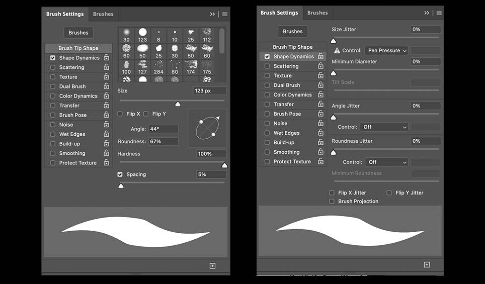
calligraphic-like brush. Access the brush settings, flatten the round brush as
shown in the reference image, and tilt it slightly.
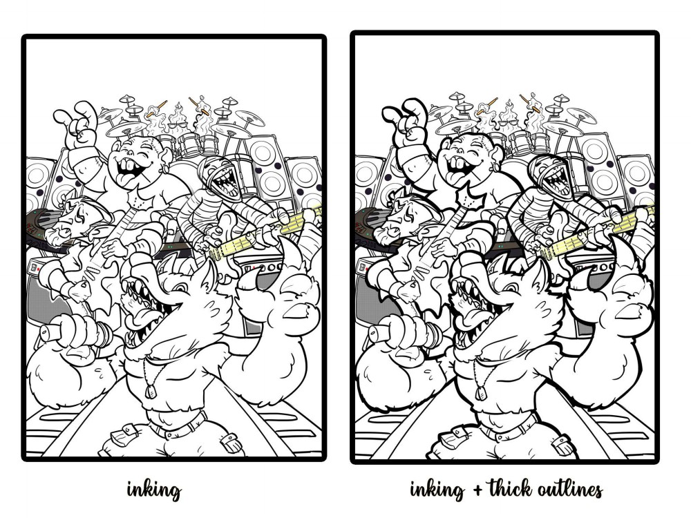
Start with even-sized strokes while working your way through the entire page.
It's typical not to get it right on the first try, and that’s perfectly fine; feel free to erase and redraw in iterations. Personally, it generally takes me 3 to 4 tries. Once you're satisfied with the initial line work, experiment with varying stroke
weights a bit—uniform strokes can appear dull on your comic book cover.
Where strokes are long, consider thickening the belly of the stroke.
I always finish up by adding a thick stroke to the silhouette, which helps the
characters stand out more on the comic book cover
Now for the fun part:
6. COLOURING
You can start filling in flat colours beneath the inked layers of your comic book
cover, keeping the colours of each character on separate layers for better
organization and easier editing. Make sure there's a good contrast between the
characters to enhance the visual impact.
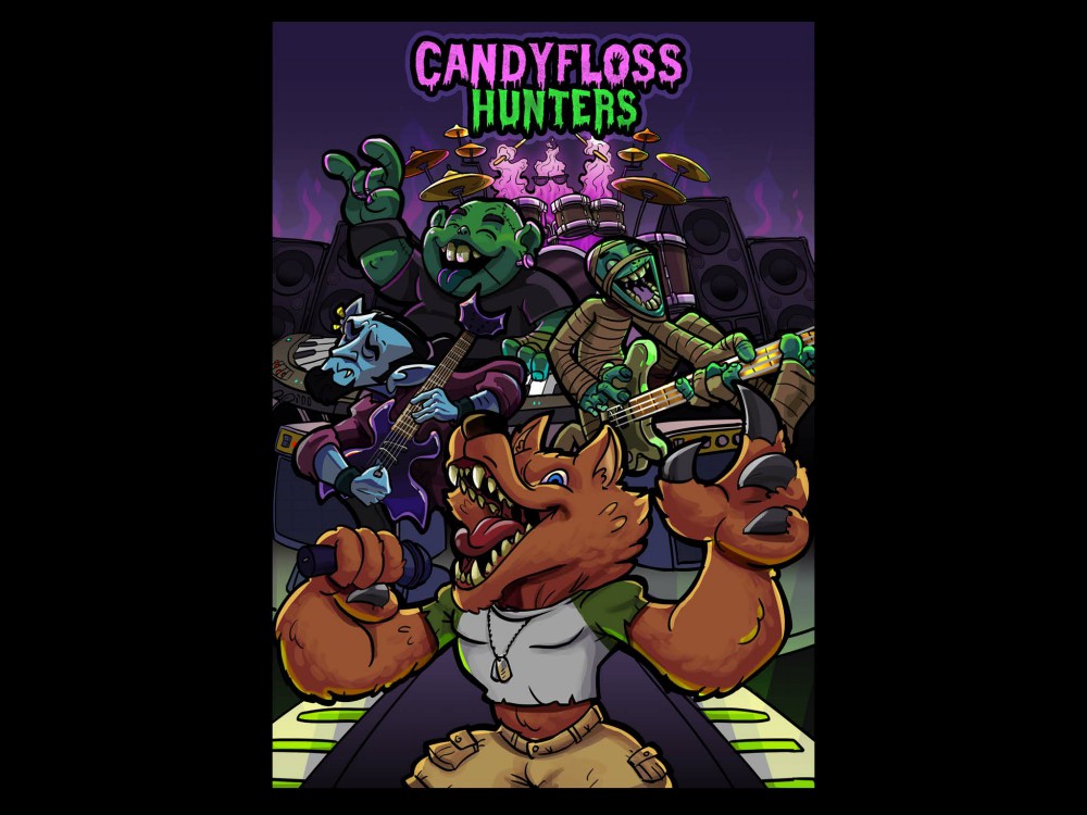
Next, determine the light source in your drawing to begin adding shadows and
highlights. For my comic book cover
, I’ve chosen the light source as indicated in the figure. Add another layer on
top of the flat colours and convert it into a clipping mask by clicking between
both layers while holding the Alt key.
Start painting the shadows with a purple hue. tinted shadows make the colours
look less muddy. Apply multiply blend mode to the shadows. Adjust the opacity
to your liking.
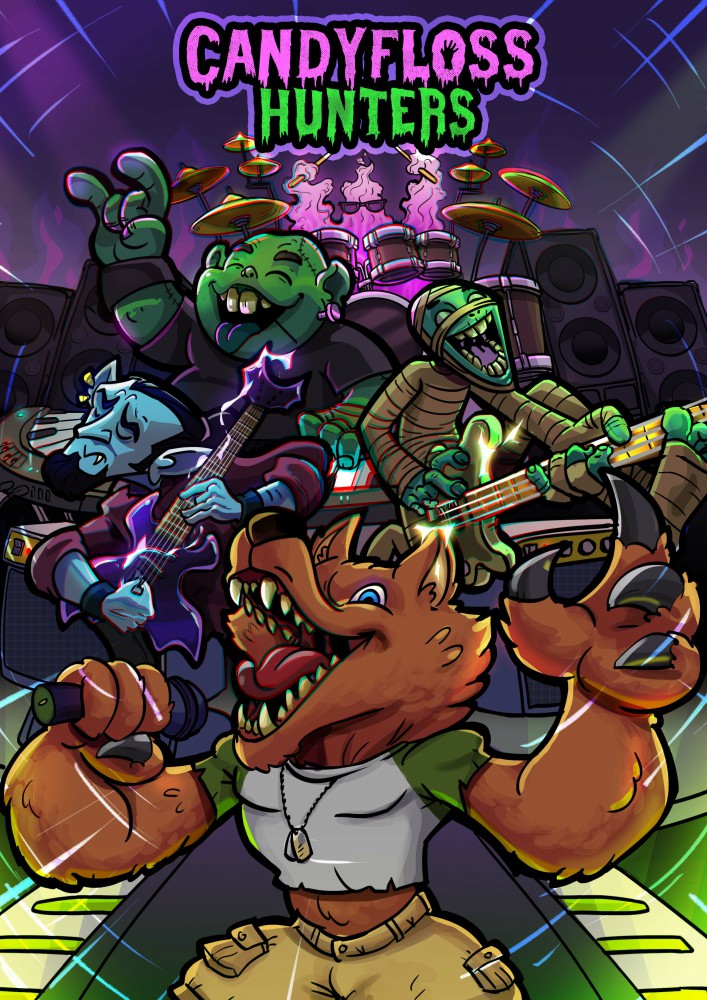
Highlights:
Adding highlights makes the characters pop and gives them a 3D volumetric
effect. The primary light source is indicated with arrows, and don’t forget the
secondary light sources, like the glowing pink alien and the stage lights, which
will also influence the character’s appearance on the comic book cover. Notice
how I incorporated these light effects on the characters in the comic book
cover in the following image.
I start painting these highlights on a new layer with the blend mode set to
colour dodge.
Rim lights:
This is my little magic trick. I use a bright rim light aligned with the primary light
source, which helps to accentuate the characters even more.
9. VFX and Nuances:
As you can see, I’ve added sparks around the guitars to convey an electric,
clinky, and metallic performance vibe for the comic book cover. Glows around
the lights enhance the action, and I’ve incorporated action lines to reinforce
perspective, creating the feeling that music is blasting from this area.
Additionally, I applied a chromatic aberration effect; if you look closely, you’ll
notice colours splitting into blues and greens around the keyboards, the
werewolf’s mouth, and the guitars on your
Voila! Our comic book cover is complete. Are you ready to rock to it?